
Cover art is a paradox: simultaneously essential and inessential to the overall quality of a musical release. After all, we’ve seen cases of great cover art elevating already excellent work as well as examples of some of the best metal ever released being packaged behind some of the worst album art ever designed. One thing that is certain is that great art will always benefit a fine album, even if the best releases are immune to the effects of poor art and design. In the end, the music is what matters most–but the visual aspect of a musical work is significant, as it contributes to the overall artistic impact of the release and has the potential to set the tone of the whole observation. In this article, we look at some of the best album art from the month’s new releases and examine why it works. And maybe we’ll look at a few of the worst covers too, just for fun.
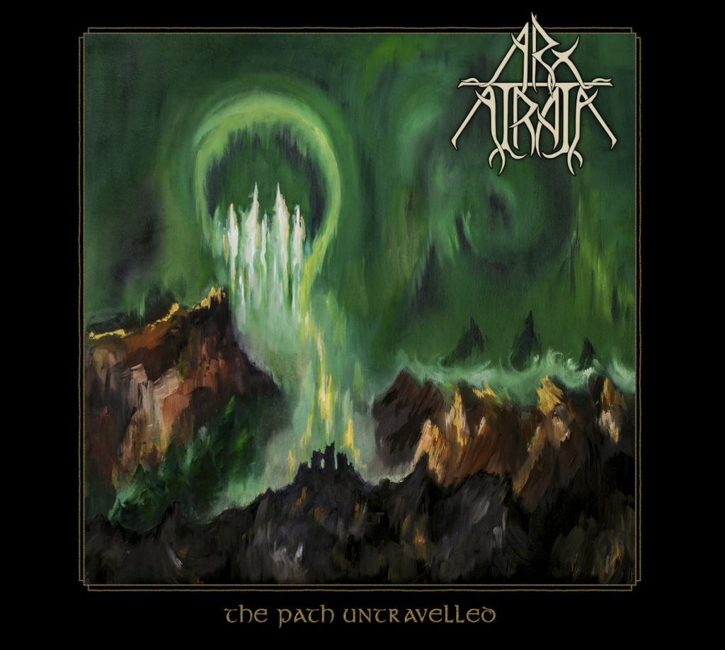
Arx Atrata: The Path Untravelled – Art by Namurian Visions
There’s a great sense of luminosity in this image, and a really nice richness in the texture. It was a tasteful decision to go with a more painterly look here. Namurian Visions’ stroke is varied without being inharmonious, and each mark is graceful and visible. I love the color scheme – the green evokes an ethereal feeling and works well with the earth tones and golds. The composition is lovely, and there’s a sweet clash of jagged shapes and soft, swirling, circular fields of softer strokes. The typeface of the album title is both clear and handsome, and I like the triangular near-symmetry of the band’s logo, all neatly seated in a classy but simple border. I’m a sucker for borders.
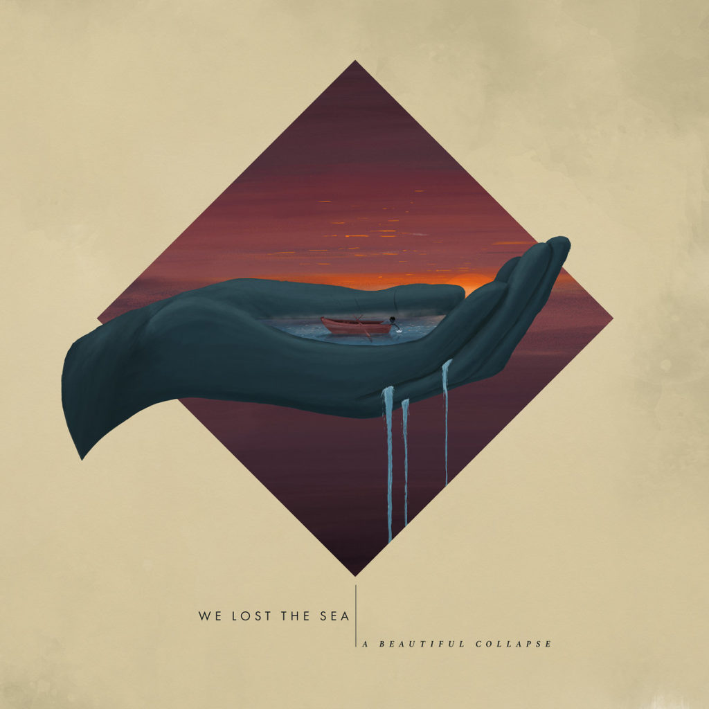
We Lost the Sea: A Beautiful Collapse – Art by Matt Harvey
In the decade of the 2010’s, minimalism is king. We’ve seen it dominate popular design, including leaking into subversive counter cultures like metal, with some examples even stirring a bit of controversy. Matt Harvey’s art for We Lost the Sea’s Triumph and Disaster, and more specifically, the superior cover image for the single A Beautiful Collapse, rides the sweet spot between plain and overdetailed. Like the music it illustrates, it’s rich with color but rounded in subtlety. The closer you get, the more layers you see. There’s a nice symmetry that’s only slightly offset by the wrist of the hand extending too far to the left of the composition. The color scheme is warm and delightful, evoking a rich naturality without being too loud.
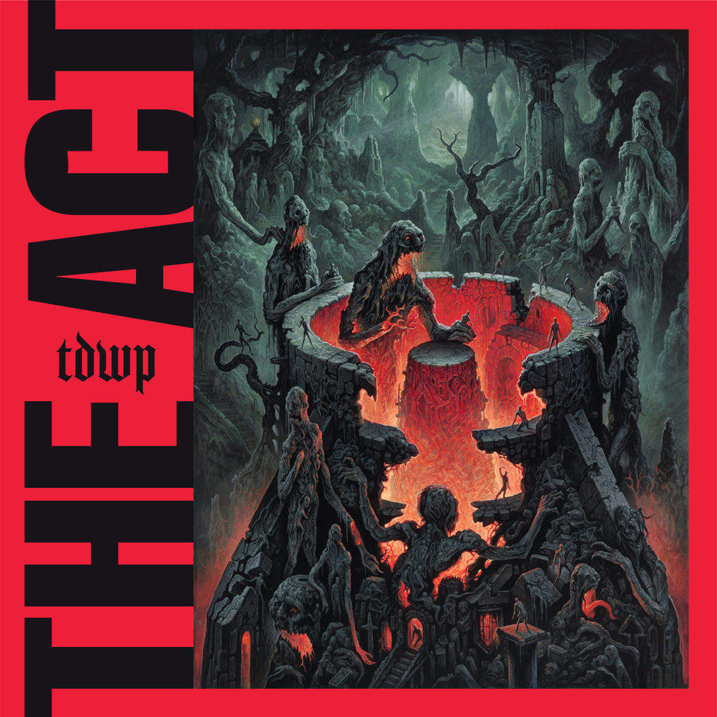
The Devil Wears Prada: The Act
One of the biggest names in Metalcore is sporting some artwork on their new record that looks like it could be right at home on a Blackened Death Metal release. The illustration itself is as fierce as any heavy band could hope – it’s a laboriously detailed composition full of intricate textures and hauntingly rendered figures. I was unable to find the name of the artist who made this image but they have done a great job with color and atmospheric perspective. The cave gets hazier and glows brighter as it recedes into the distance, but the bold red light creates a stunning contrast at the center of the image. It’s a scene that is sublimely horrific. Now just ditch the distractingly huge album title in its asymmetrical red border and you’ve got one of the best covers of the year.

1349: The Infernal Pathway
I find that black metal covers usually do a pretty good job establishing the mood of their records with the cover image. And what I mean by that is that they look evil. The best ones balance that with some affect of grace or beauty. The Infernal Pathway definitely features a terrifying central image, but the black and gold color scheme, while simple, is quite striking, and the intricate lines create a sweet border with fine contrast. There’s also a great range of value in the face and surrounding heptagram design.
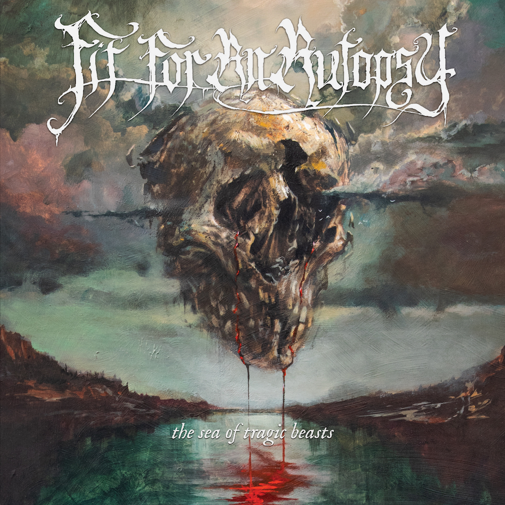
Fit For an Autopsy: The Sea of Tragic Beasts
This is a gorgeous cover. I do think they went a little overboard with the colors, but they’re muted enough to keep the image unified. The harmony of stroke here is fantastic. I really like the bright red creating a second focal point away from the skull in the high center. It’s an image that’s just abstracted enough and just representational enough. The hillsides in the distance and their reflections create a really nice framing effect. The drawback is the band’s logo, which is not only an awkward design, but is plastered entirely too large over the top of the composition. The small and subtle album title at the bottom is a far better decision.
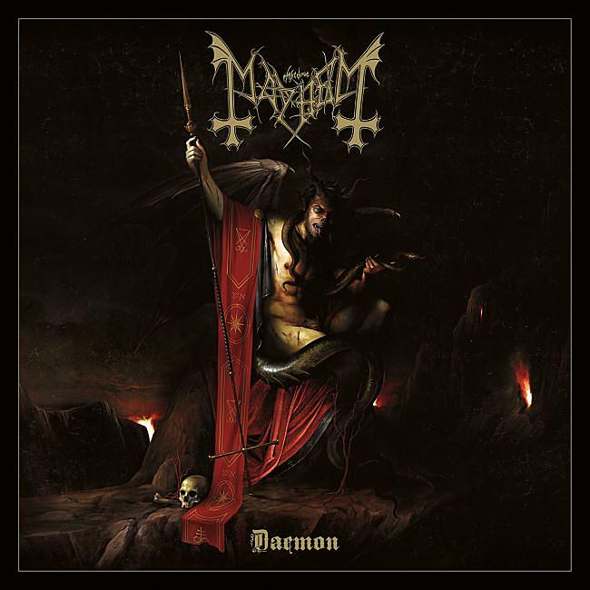
Mayhem: Daemon – Art by Daniele Valeriani
The baroque style lends itself well to metal imagery, as it can often model the duality of darkness and grace. We’ve seen it used to great effect before and it’s used to great effect here as well. The image is detailed in all the right ways but still enjoys most of the upsides of simplicity. I love the tenebrism and the way it emphasizes the central figure as well as the band name and album title. Nice use of a border, too.
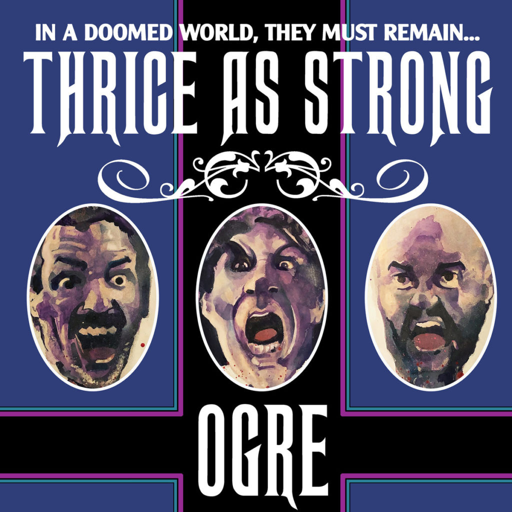
Ogre: Thrice As Strong – Art by Will Broadbent
An album cover doesn’t have to be elegant for it to be successful. Ogre’s new album art is really well designed and delightfully cheeky. It reminds me a lot of the Grammy-winning cover for the Black Keys’ “Brothers.” There’s a little more boldness to it though, and it’s extremely well designed and composed. The faces of the band are nicely rendered and from what I’ve heard, when the outer sleeve is removed from the recording package, their heads are revealed to be impaled on pikes. I don’t have a physical copy to verify that, but if it’s true, it’s a clever surprise. In metal, it’s difficult to be facetious without being cringey, and Ogre got it exactly right with this release.
There are a lot of other great covers releasing this month, and these were just a few of the best. We’re in the midst of an artwork renaissance–for a while, the emphasis on cover art seemed to diminish as physical editions of records became smaller (with the transition from vinyl to CDs) and then nonexistent (as more consumers switched to digital). In the last few years, possibly in part due to the resurgence of vinyl, and possibly as part of a widespread popularization of tasteful design in media, bands seem to be putting more effort and resources into the quality of the recording package. However, there are still plenty of duds. We might not see something as bad as Dance of Death ever again, but we do get to enjoy the occasional swing-and-miss album art. These are a few of the eyesores from this month. Let me note that just because I don’t like the cover, that doesn’t mean the music is bad too. A metal album is first and foremost a piece of music.
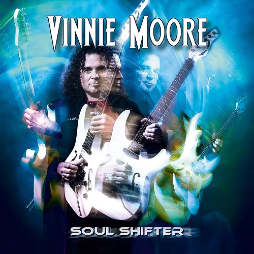
Vinnie Moore: Soul Shifter
Vinnie Moore is a fantastic guitarist and a major contributor to the shred explosion in the late 80’s. His new album looks like a leftover draft from that era. It’s a disaster; the cheesy multi-portrait effect, the dated plain white typeface with a black outline and drop shadow, the sci-fi phasing on the album title…I don’t know whether to laugh or scream.
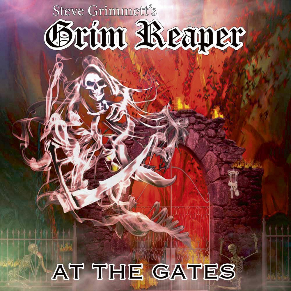
Grim Reaper: At the Gates
How ironic that the name “At the Gates” would give us yet another atrocious album cover. Only this time, it’s the name of the record, not the band. The reaper figure is poorly rendered and badly pasted over an amateurish gate, which is in turn badly pasted over an overly colorful backdrop. There’s no sense of real space or connection between the three layers here. And to top it all off, we’re again stuck with bland black and white text, including a cliched use of Copperplate on the album title.
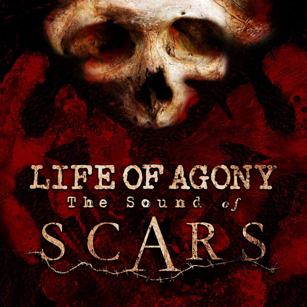
Life of Agony: The Sound of Scars
This is just an ugly cover. The overly gritty colors, the pseudo-typewriter font, the inexplicably and unnecessarily huge “A” in the center…it’s hard to look at. It looks like what an algorithm would generate if it were told to create a hard rock/heavy metal album cover.
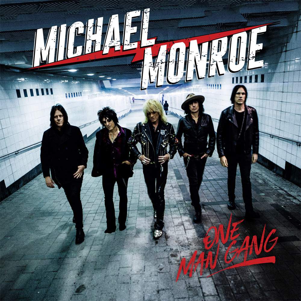
Michael Monroe: One Man Gang
What? Why? I have so many questions. Is that a subway entrance? Why is there casually a person in the background, moving the other way as if five middle-aged guys in black leather didn’t just walk past them side-by-side? Why such sterile lighting? And why is the album called “One Man Gang” if you’ve got a gang of FIVE GUYS right there on the cover?
Thanks for reading. If you want me to break down a specific cover, or if you think I’m an idiot with terrible taste, let me know in the comments, and I’ll be back next month to look at more metal art.
Connor loves puppies and death metal but prefers death metal. He has degrees in Commercial Music and Art & Design, both from Utah Valley University.